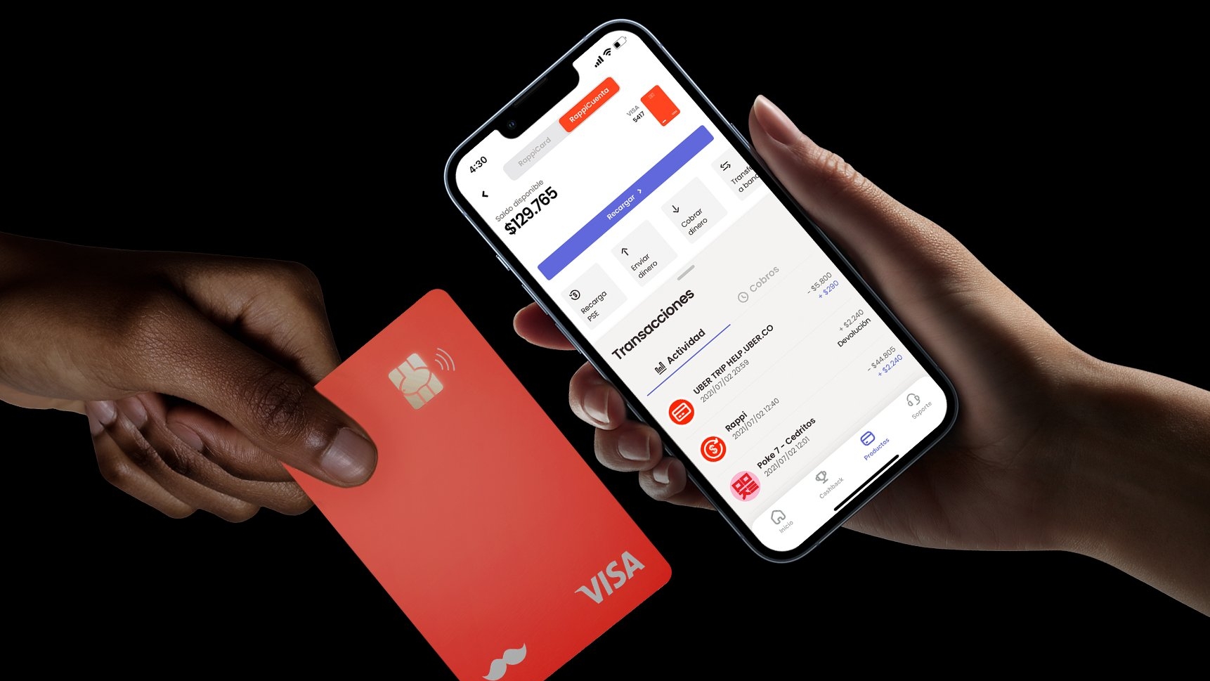
The problem of visual convergence in financial apps
White or black backgrounds, gradients, minimalist icons, sans-serif typography. That’s the real problem facing digital financial companies today: it’s not that they have bad design — it’s that they all have the same design. Fintech design has converged, and when everything converges, nothing stands out.
In this type of project, UX and UI need to be aligned from the start. A polished UI built on top of poor UX creates frustration in the user, despite the aesthetics. And solid UX paired with a generic UI goes unnoticed in a saturated market.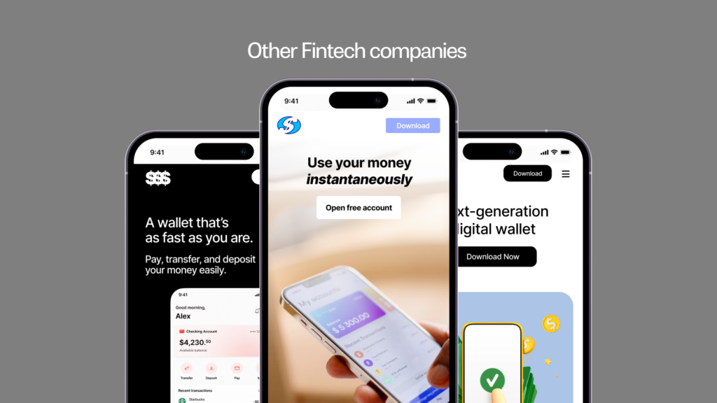
UX and UI: Architecture and aesthetics working together
UX, or user experience, defines how a product works: the navigation logic, the information hierarchy, the flows that take a user from point A to point B without friction. It’s the invisible architecture that determines whether someone can complete an action before getting confused, frustrated, or giving up.
UI, or interface design, is the visual layer: the colors, typography, and components the user interacts with. It’s what turns a functional architecture into an experience with its own identity.
Case study: Rappi Pay and the challenge of digital identity
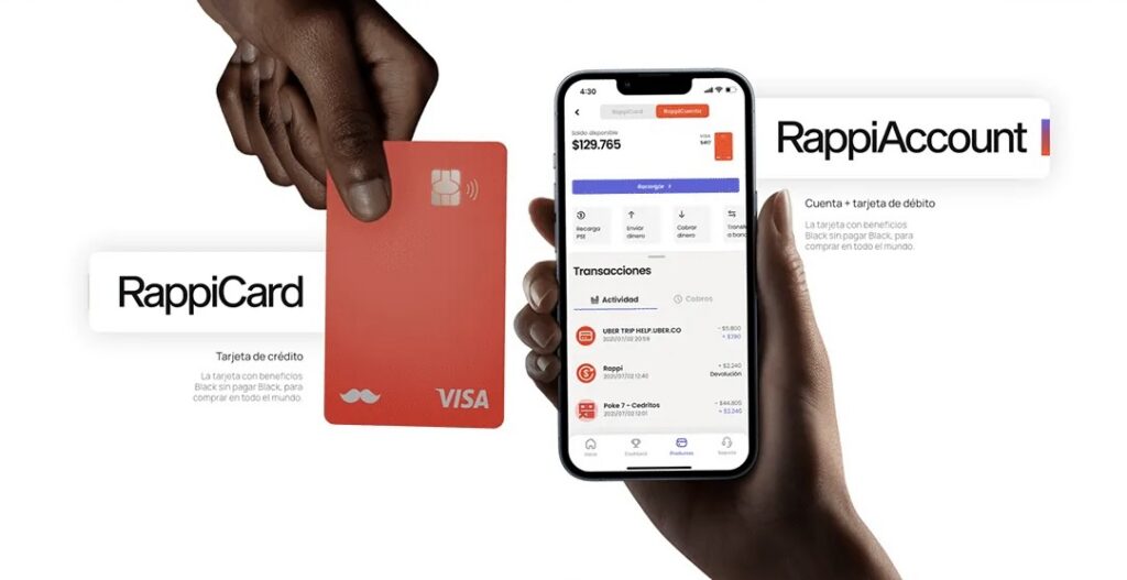
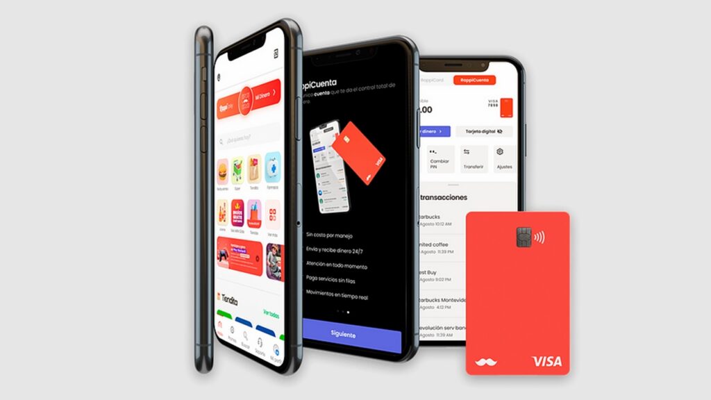
Rappi is one of the largest digital services platforms in Latin America. Its financial product, Rappi Pay, includes the Rappi Card — a credit card designed for frequent users with specific benefits tied to the Rappi ecosystem. In a context where the fintech sector in the Southern Cone has grown by more than 300% over the last five years, the competition for user attention has never been fiercer.
The design challenge was far from simple: communicate a financial product within an already established digital ecosystem. It ment serving millions of users with high experience expectations, and differentiate it in a market where digital credit cards compete with nearly identical visual resources.

The goal was concrete: help users understand, in the shortest time possible, how to get the card and what benefits it offered. Two questions, two answers, no noise in between. Any friction along that path was a missed conversion opportunity. We worked on the UI design of the experience, starting from the information architecture defined for the product. On top of that, we built a visual identity that could live within the Rappi world without disappearing into it.
The decisions that define the experience
Information hierarchy as an invisible guide
In a financial app, users arrive with a clear intention: they want to understand something or do something. The job of UX is to anticipate that intention and put what they need exactly where they’ll look for it — without making them think.
For Rappi Pay, this meant defining an information hierarchy that put the two most relevant pieces of information for new users front and center. These were: how to get the card, and what benefits it includes. Everything else takes a back seat — available, but not competing for the user’s attention.
Users don’t always notice good hierarchy. But they always notice its absence. When users don’t know where to look, they hesitate — and hesitation in a financial app almost always ends in drop-off.
Strategic use of color: why pure black doesn’t work
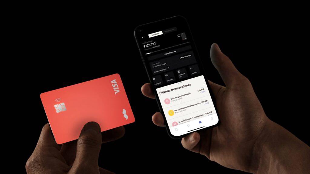
We chose the color palette as one of our first design criteria. We built the interface on dark tones — deep blacks and grays — accompanied by gradients that add depth without overwhelming the screen.
There’s a detail that seems minor but defines the perceived quality of the entire interface: in UI design, pure black rarely works well on screen. The human eye perceives it as too dense and it causes visual fatigue with extended use. A shade of black produces the same feeling of elegance and sophistication. It’s a very dark gray with a slight color temperature that doesn’t tire the user. This isn’t just aesthetics, it’s digital ergonomics: poorly managed contrast reduces session time in the app because users fatigue before completing what they came to do. In designing Rappi Pay, we chose tones that allow users to operate their wallet for longer without discomfort. Users never notice this decision, but they feel it in every session.

The product as the hero
Even in a digital product, users still desire the physical card. It’s the tangible symbol of the product — the promise made real. We built the design to let that object stand out: contained backgrounds that support it, visual composition that brings it to the foreground, image treatment that makes it look like something worth having.
When the background competes with the product, users don’t know where to look. When the background supports it, the product speaks for itself. That difference — which might seem subtle in a screenshot — is decisive in how quality is perceived in a financial app.
Identity over trend
The most strategic decision wasn’t about color or typography. It was about stance: building a visual identity of its own rather than following market patterns.
The visual treatment of Rappi Pay — the dark palette, the use of gradients, the way we compose images — sets the brand apart from other digital cards that rely on the same visual resources. In a market where financial products are increasingly similar in functionality, design is one of the few territories where brands can still build something truly distinctive.
Conclusion: Design as a translator of brand identity
After several projects in the financial and fintech space, one thing keeps coming up: companies that arrive with a clear identity and a well-defined information hierarchy get different results. different results. They generate more trust, reduce friction in key flows, and build a brand perception that justifies the user’s choice.
The most common problem isn’t a lack of budget or talent. It’s that many companies come to design without knowing what they actually want to communicate. A brief that says ‘I want something modern and clean’ gives the designer very little to work with, and the result almost always looks like what already exists. A brief that defines the brand’s personality, who it speaks to, and what it needs to achieve for the user produces something entirely different. Design shouldn’t invent a company’s identity — it should translate it.
Does your financial product look just like everyone else’s?
At 451° we don’t just design interfaces — we build competitive advantages through user experience. If you’re shaping the future of your financial product and looking for a perspective that combines strategic thinking with high-level UX/UI design, take a look at how we’ve approached similar work in our portfolio.