

Challenge
Trading can feel complex and intimidating. TradeStation needed a brand that made it feel modern, innovative and within reach.
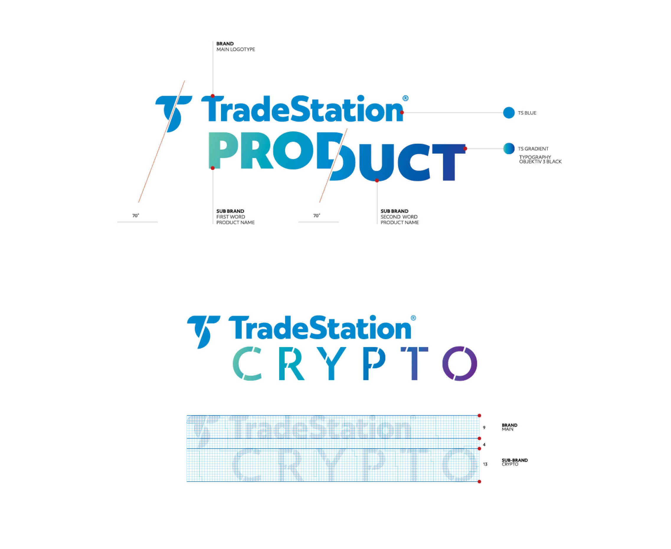
The work meant refining the symbol and wordmark, building an architecture for sub-brands and products, and creating a visual system flexible enough for digital platforms, campaigns and internal communication.



Final thoughts
TradeStation now has a brand that is a step ahead, just like the financial world it wants to build. Crypto is not cryptic anymore.
A refined symbol built on a precise grid, a teal-to-purple gradient, a custom icon set and a bold, confident voice come together across digital pieces, campaigns, posters, editorial material and merchandise.
Next projects.
(2016-25©)


